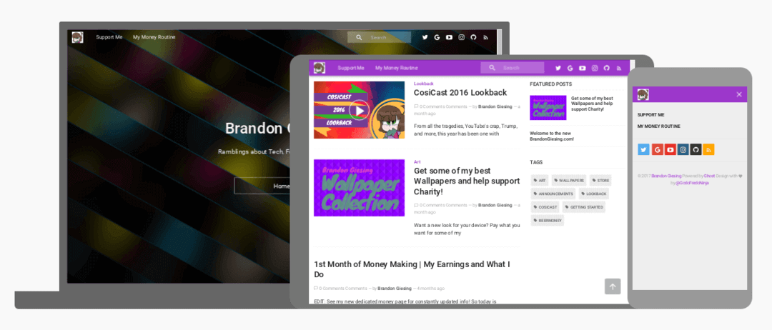
BrandonGiesing.com: The Nepdate!
Funny titles aside, welcome to a new year with a new redesign for the site! Keep reading to learn about the changes or skip to the bottom for a tl;dr changelog.
What's New?
Theme
The theme is changed from Caffeine by Kelvin Nguyen to Mapache by GodoFredo. Both themes are good but I liked the more modern style and easier customization of Mapache.
Example: Caffeine required code editing to change Social links and logo while Mapache does it with Ghost's simple Code injection making it easier to update.
Also it adds some cool extras! See that fancy box above that I used for the example? That's one of the them but here's some others:
- Special layouts for image and video posts
- This post is using the image layout for the giant header image.
- The video layout (Example here) adds a YouTube sub button and a play icon to the post thumbnail in addition to making the video big like the image layout.
- Buttons with special icons (example below)
Also like all my other social media profiles, I changed the header/cover and profile image to match. No longer does it have the wallpaper that won Nextbit's contest and my avatar with a blue background. Now enjoy the glossy Check It background and a enhanced avatar with a white background and more detail.
Content
I know I haven't posted much here yet but as I said in the original "new site" post, I don't have a schedule of posts and they will come at any time.
That said, I do want to post more so here's a few ideas to start with.
- Since the theme has a video layout, I might start posting all videos as a post here like I did with the Lookback video.
- I mostly did that because the description was too long for both YouTube and Vidme but it might be nice to do this as I can use it to link other sites that don't have descriptions or really short lengths to videos easier (Instagram, Coub, Twitter, etc.)
- Do more review/tutorial/longform things in general.
- I eat a lot of limited time food items so why not talk about them for example.
Either way, keep in mind that this is still a "personal website" and not really a "blog" so content can be anything really.
Money Routine
Yes, this is probably the main thing people have been here for so a few bits of info here:
- I update it when I feel like it. (Not every week, month, etc.) so be patient.
- I'm still trying to move tips to separate pages to simplify the page.
- I will also likely split the page up into a multi-page post and add some more tutorial like info instead of just listing stuff
- Introduction and Changelog
- How to get started
- Device List and Tips
- Earnings List
New Pages
I'm planning on adding more pages to the site to fill some gaps. Currently the two pages are the Money Routine and the Support Me/Donate page but there's some more that need added.
- About Me/Bio
- My Projects (Current/Past)
- Possibly others
Once I do this, the old site will definitely be obsolete with everything moved over or redone.
TL;DR Changelog
- New Design
- New Theme: Mapache by GodoFredo
- New Cover: Check It Glass
- Updated Avatar: White background, more detail
- New/Updated Content
- Video Reposts from YouTube/Vidme
- Reviews: Food, Tech, etc.
- Tutorials
- Money Routine
- In Progress: Moving Tips to separate posts
- Not Started: Reorganize into multiple pages
- New Pages
- About Me/Bio
- My Projects (Current/Past)
The site is currently being actively worked on so please be patient as things could be wonky, stuff missing/broken, or offline at times!
So if you have ideas or an issue, let me know!
- Comment below
- Email me at me@brandongiesing.com
- DM on Twitter
